Interactive products, clearer stories, stronger conviction
Products that move when you scroll into them.
This page is built to feel less like a gallery and more like a launch narrative. The flow is clearer, the typography has more restraint, and the product screens get more room to land.
The page should read in three calm beats: one connected system, one polished consumer surface, and one credible product thesis.
Unified system
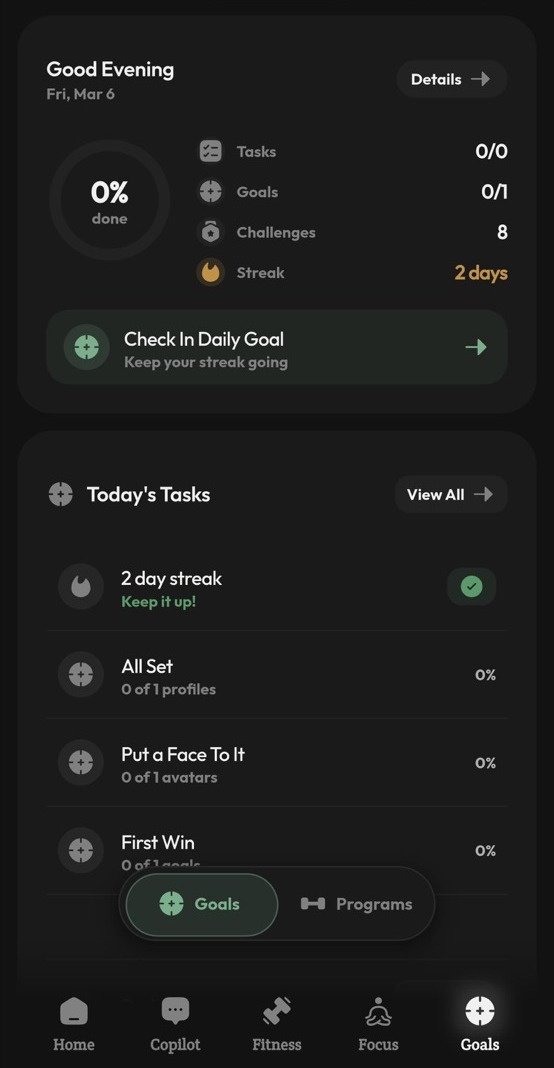
Meals, movement, focus, and progress work as one system instead of four disconnected habits.
Consumer-grade polish
The product feels calm, premium, and repeatable instead of purely functional.
Business logic underneath
Retention loops and action flows suggest a product engine, not just a strong visual concept.
Two product stories. Two different levels of readiness.
Ohga is presented like a stronger consumer product thesis. Fluent Flow stays lighter for now, but the layout still frames it as an evolving desktop workspace rather than a loose set of screenshots.
AI wellness that feels like a single operating system.
Ohga is the strongest story in the current set because it already feels like a connected product, not a bundle of features. Workouts, nutrition, focus, goals, hydration, and progress all speak to each other.
One app, not five
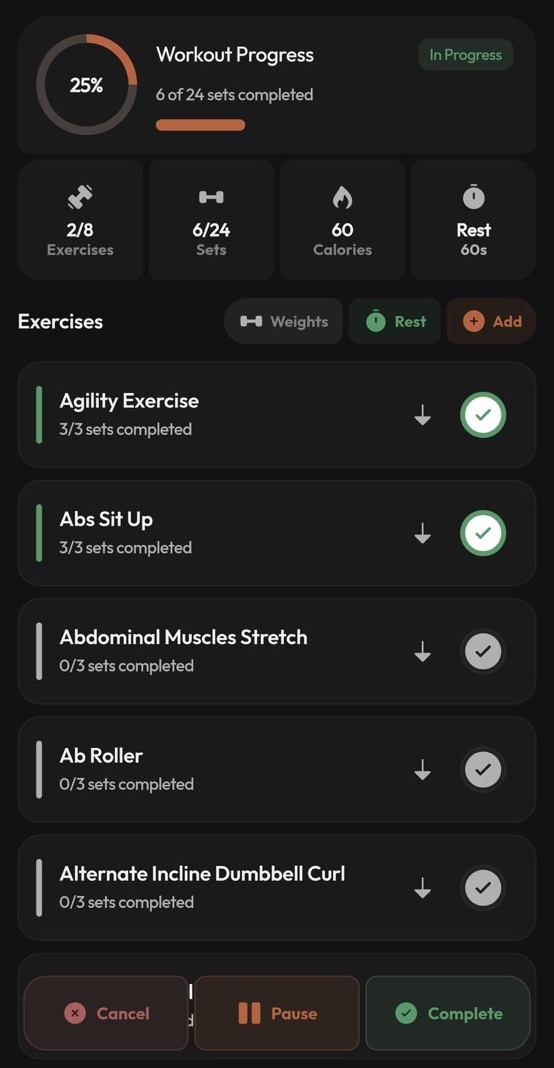
Ohga combines food logging, workout planning, focus routines, water tracking, goals, and progress loops in one coherent product.
AI that can act
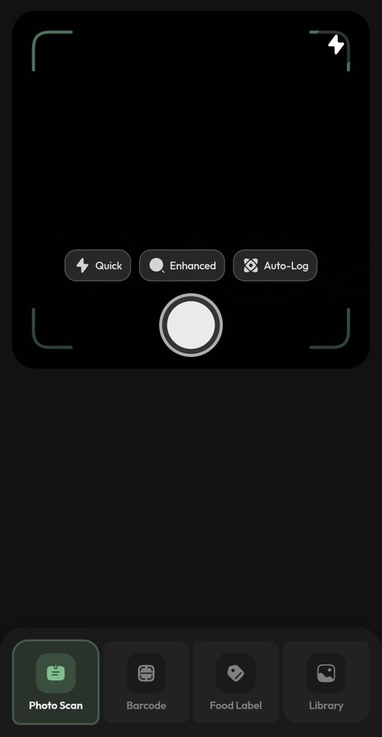
The copilot does more than answer questions. It can trigger in-app actions for workouts, meals, reminders, and guided sessions.
Real personalization
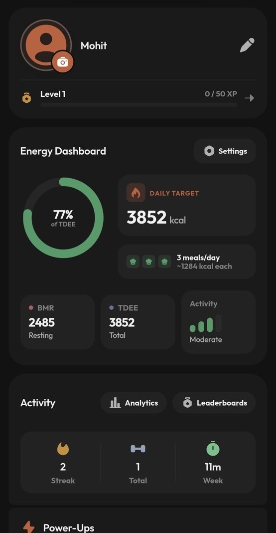
Energy reports, goals, food suggestions, and daily recommendations adapt to your profile and recent behavior instead of using generic templates.
Trust built in
The product is shaped around consent-gated health data, privacy-conscious design, and an offline-first experience that still feels premium.
The screens are framed as active product moments instead of static screenshots.
Better framed for the user, and sharper for the person evaluating the business.
The page now separates emotional user value from product strategy. That gives the visitor a cleaner read on why the app could matter in-market, not just why the UI looks interesting.
This is easier to return to every day than a fragmented stack of health tools.
It removes daily friction
Most wellness users bounce between separate apps for meals, workouts, hydration, focus, and progress. Ohga turns those scattered decisions into one daily system.
It gives useful momentum
Quick actions, streaks, missions, and visible progress loops make the app feel active instead of passive. Users do not just log data, they feel guided.
It feels premium enough to trust
The dark visual language, structured cards, and calmer UX give it a polished consumer feel instead of a generic AI utility look.
There is a real product business hiding inside the app logic.
Retention loops are already visible
Streaks, risk nudges, goals, gamification, and social accountability create reasons to return beyond one-time setup or occasional tracking.
The category is broader than fitness
Ohga can grow across nutrition, focus, coaching, social features, and premium personalization instead of living inside a narrow single-use niche.
The product logic can scale
Offline-first sync, AI action flows, wearable integration, and admin-grade operations suggest a product system that can support serious growth if executed well.
- The AI is framed as an operator inside the product, not just a chatbot wrapper.
- Energy science, nutrition, workouts, and focus are connected, so every feature has context from the rest of the system.
- Gamification and social mechanics give the product more shareability and survivability than a typical health tracker.
The product loop is already visible in the screens.
The content now arrives in an ordered narrative: context, action, guidance, and adaptation. That gives the visitor a clearer sense of flow as they scroll.
Capture the context
Onboarding, preferences, goals, and health signals build the baseline so the app knows what matters for each user.
Turn inputs into actions
Food analysis, quick logging, workout planning, and AI guidance turn raw data into something the user can act on immediately.
Guide the day
Workout builders, task loops, and structured quick actions reduce decision fatigue and keep users moving through the day.
Adapt with energy and progress
Energy dashboards, streaks, profile metrics, and progress analytics keep the system adaptive instead of static.
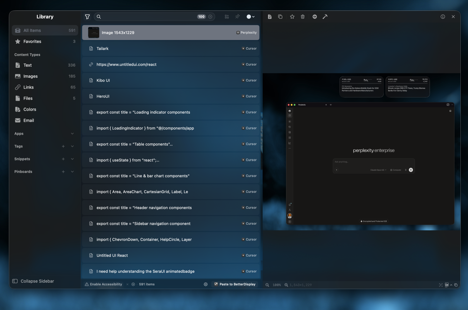
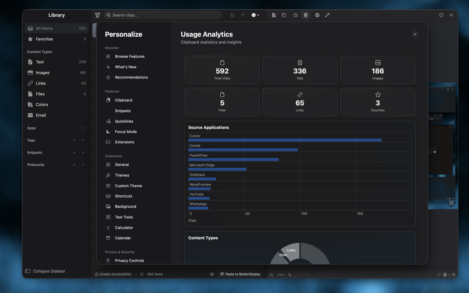
Early workspace tooling with a stronger desktop stage.
Fluent Flow is still the lighter story, so the page frames it as a confident preview. The current screens already suggest a workspace centered on saved material, quick retrieval, and usage visibility.
A library-first workspace for storing text, links, files, colors, email references, and snippets.
Fast capture plus organization, so saved material stays useful instead of turning into another dump.
Usage analytics and personalization patterns that hint at a deeper productivity system coming next.
Want a walkthrough of one of these products?
Ohga is ready for a deeper conversation now. Fluent Flow will get a fuller breakdown as the latest screens and product notes land.